
Product Direction
Team Leadership
Zero to One
Go-To-Market
Mobile Design & Handoff
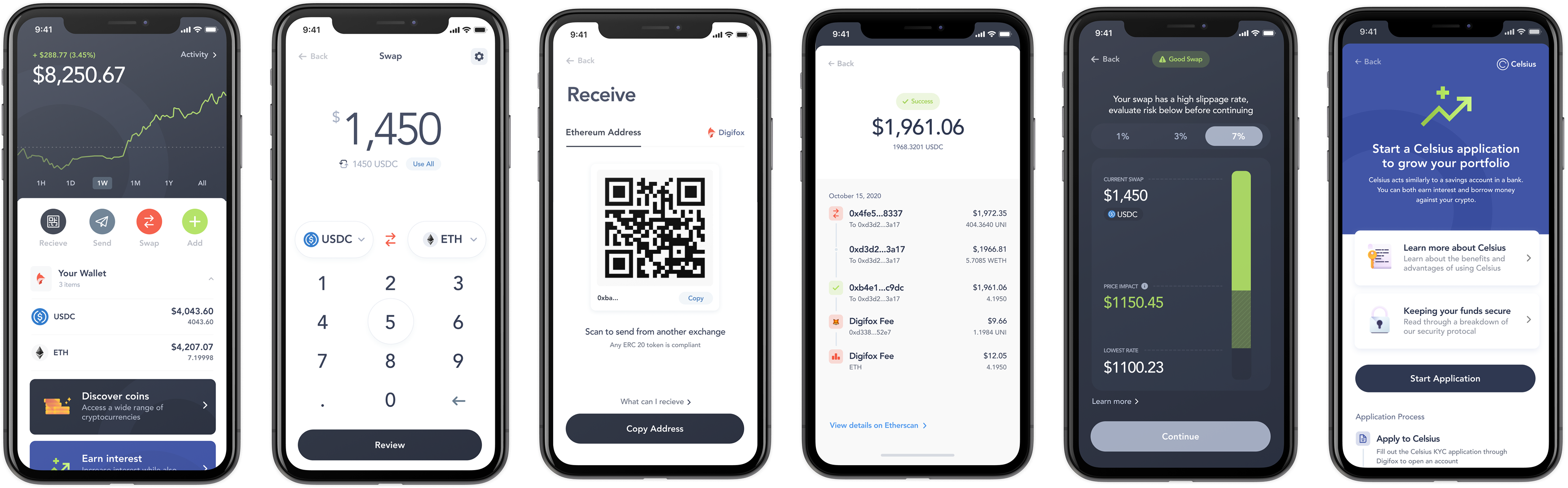
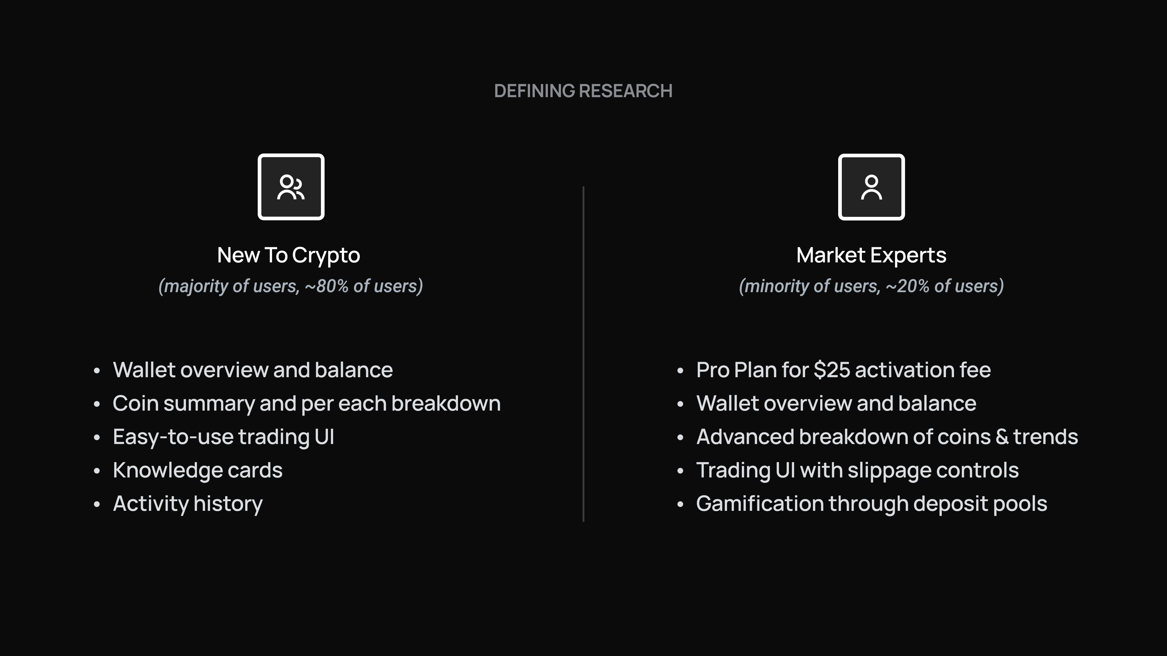
The problem wasn't the idea. Digifox wanted to make crypto legible to ordinary people, and the market was there - but the existing product read as another expert-only trading tool. Investors weren't seeing the vision because the product wasn't showing it.
I ran a strategy and scoping session with founder Nicholas Merten to separate the two questions worth answering: what does this product have to be for a first-time user, and what can we credibly build in four months? Everything after that was downstream of those two answers.
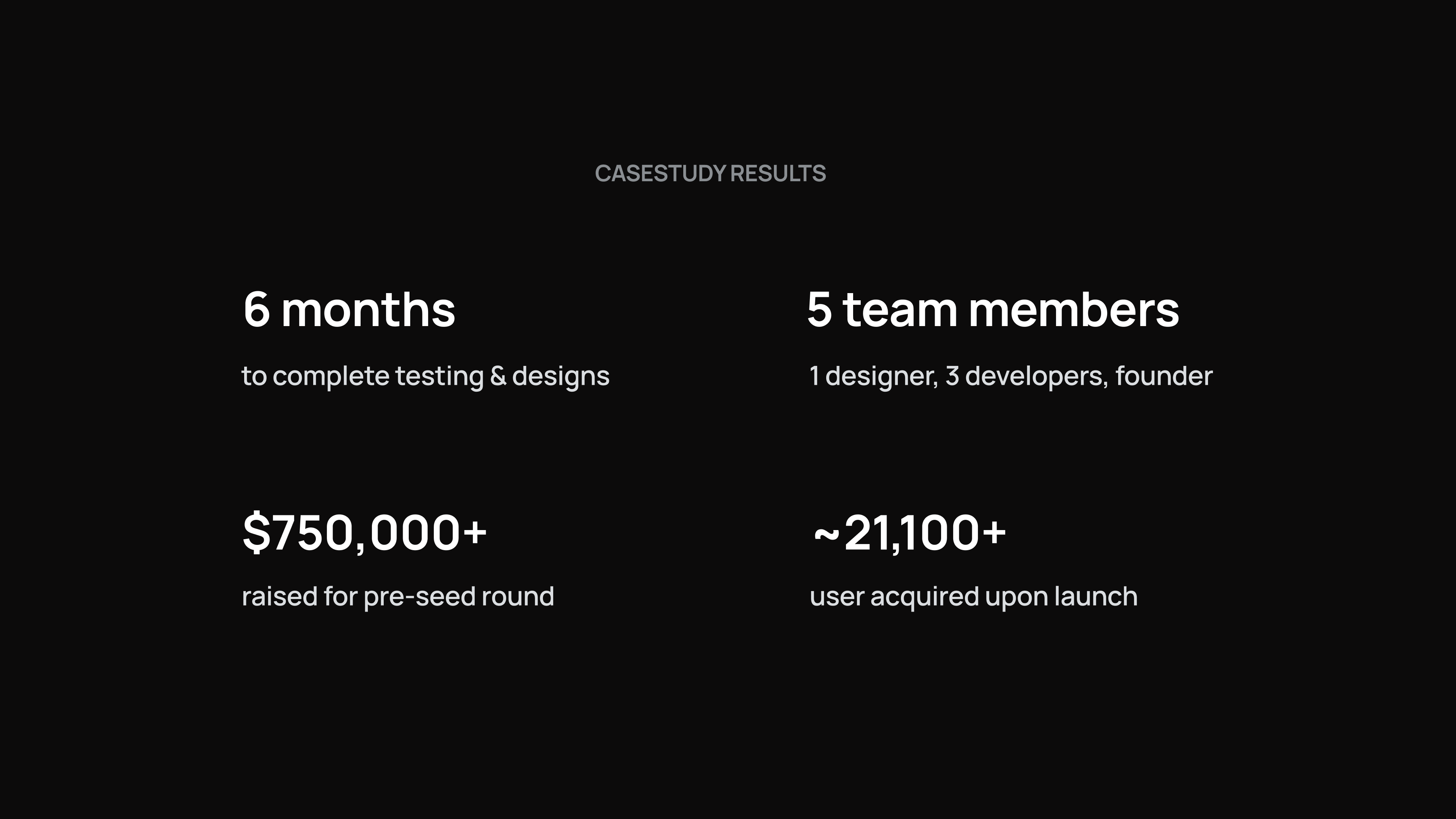
The beta was designed, prototyped and prepared for developer handoff in four months. It raised nearly $1M.
Digifox's mission was to make a complex financial world usable - invest, spend, send and manage money in one place. The strategic call I pushed for was reduction: rather than exposing crypto's full surface area, we defined the product as four jobs a first-time user could name without instruction.
Wallet, Earn, Spend and Contacts became the entire navigation. Wallet gives an at-a-glance view of holdings and market movement. Earn moves money from a bank account into 14+ currencies. Spend - shipped as a signalled Coming Soon rather than a half-built feature - sets up the Digifox card. Contacts handles sending and receiving.
Naming the tabs after actions instead of asset classes was the single decision that did the most work. It set the vocabulary for the product, the marketing copy and the investor narrative, and it held as the team grew.
Fintech has a colour problem: nearly every crypto and finance app defaults to blue or green, and the category reads as identical at a glance. The founder wanted red. Rather than treating that as a constraint to work around, we used it as the positioning - a soft red tone and a clean fox mark that made Digifox recognisably not another trading terminal.
I extended the same logic past the visual identity into the language. Every feature got a plain-English label - "Earn cryptocurrency," "Trade cryptocurrency with friends" - and we held that standard across UI copy, onboarding and marketing. Consistency in tone did as much for approachability as anything in the interface.

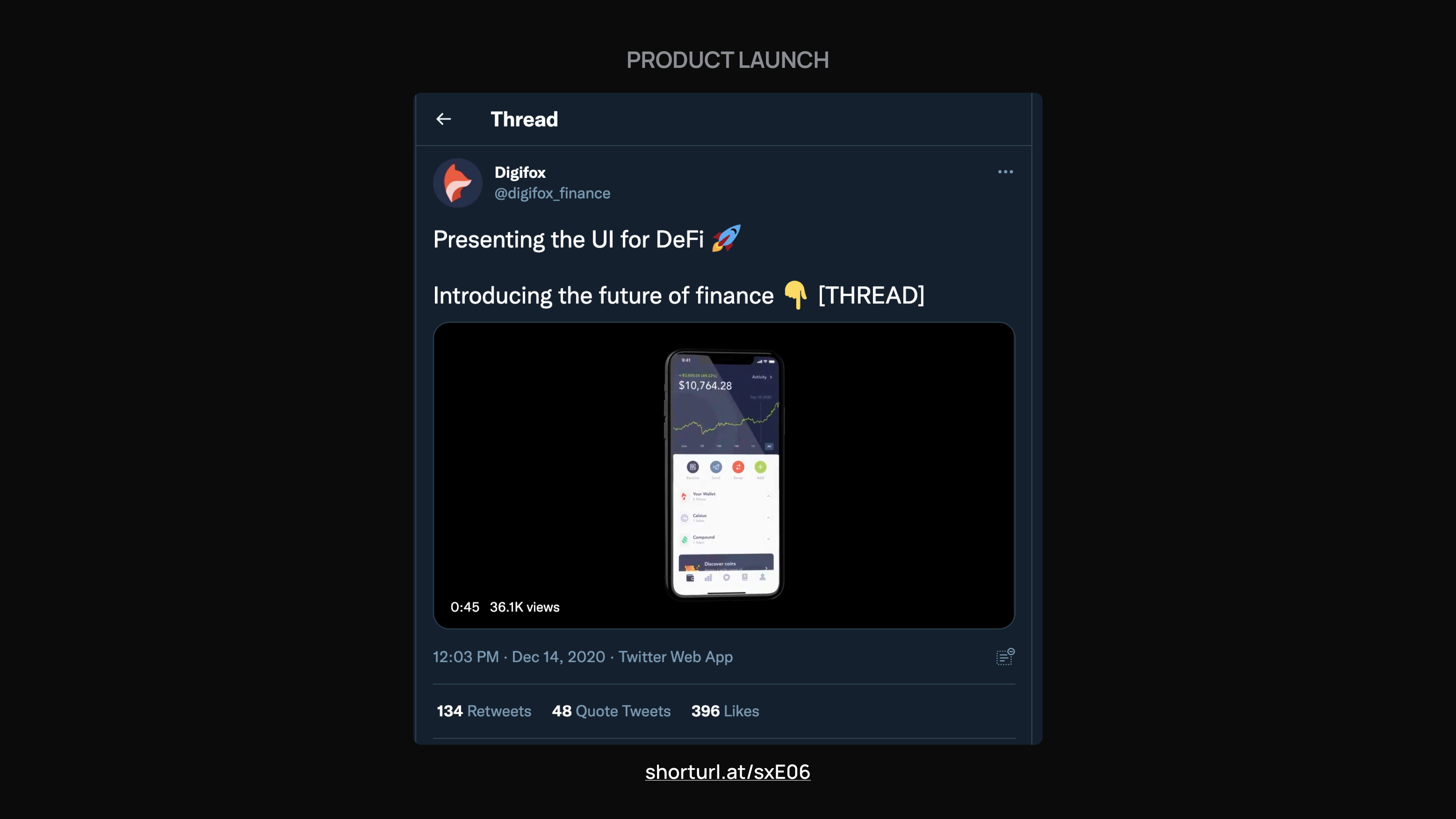
The main screen of the mobile application is what makes Digifox shine. On the Wallet tab, an overview of a user's digital wallet shows along with the progression or falls of the cryptocurrency market in relation to their account.
We wanted to have a simple user experience for the main screen, allowing users to glance over their earnings or losses at the time and seeing a breakdown of each cryptocurrency they've bought. The screen was an iterative process with the founder, we wanted to make sure it showed the key values of Digifox and actions a user could take quickly with their crypto right in front of them.
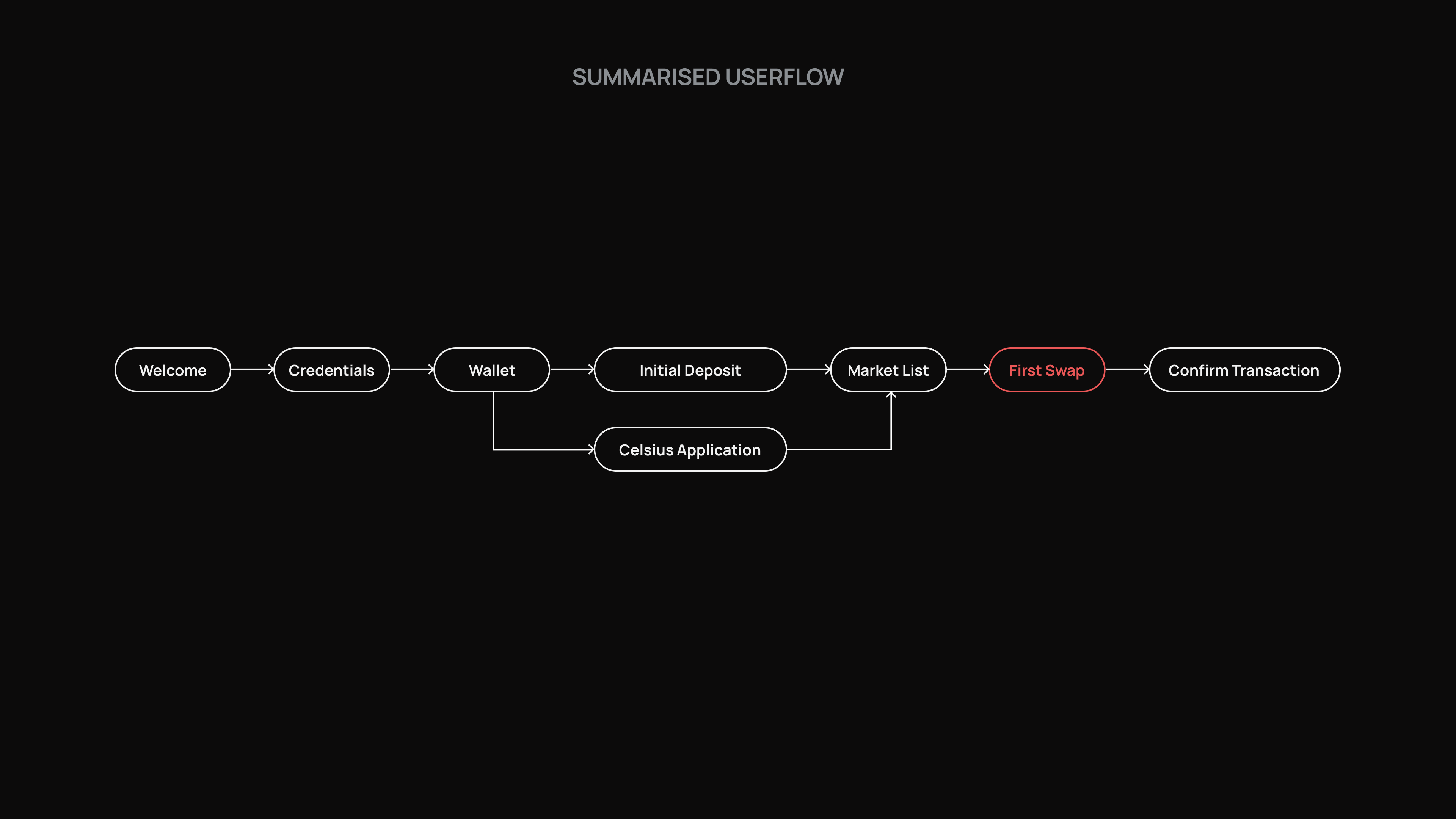

This feature allows users to spend their cryptocurrency on the market or buy new types. As a team, we downloaded all the competitor apps and looked through their process to see what worked and what didn't. We found that each were complex and used terms someone new to cryptocurrency might not know, even ourselves included! As the designers of the beta, we wanted the process to be simple and visually showing what's happening with the cryptocurrency.
A user selects the type they've already purchased to start with and manage the amount, such as deposit into their digital Wallet or withdraw to an associated bank account. If a user wanted to buy a new type of cryptocurrency, they can with a third-party market and API from Celsius or Compound (as recommended from the founder to use).
Digifox shows the transaction with the amount in cryptocurrency, dollars and the cost to make the transaction. Users get a detailed flow of what's happening and break down the process as if they were making a normal transaction on any other good. Cryptocurrency doesn't have to be complicated or just limited for the expert to use.

With Digifox, you can send money anywhere across the globe in a matter of seconds and for as little as $0.05. Users are able to view a list of their friends or family within their contacts to send cryptocurrency to, set the amount and watch the transaction happen. Also, each user has a unique QR code associated with their account, allowing scanning of the code to add a person into their native contact list or send money to and view their transaction history.

Due to a high-end product launch and key consumer data validating their idea, Digifox had no problem securing their seed round and quickly gained over 20,000 users. Their success was driven by a strong market fit, seamless user experience, and a clear value proposition that resonated with early adopters.
Rather than taking a typical hand-off approach, I focus on building long-term partnerships with the companies I collaborate with. By embedding myself in the product journey, I provide strategic design guidance, continuous improvements, and a shared commitment to scaling and evolving the business.
raised for a pre-seed round
users acquired upon launch

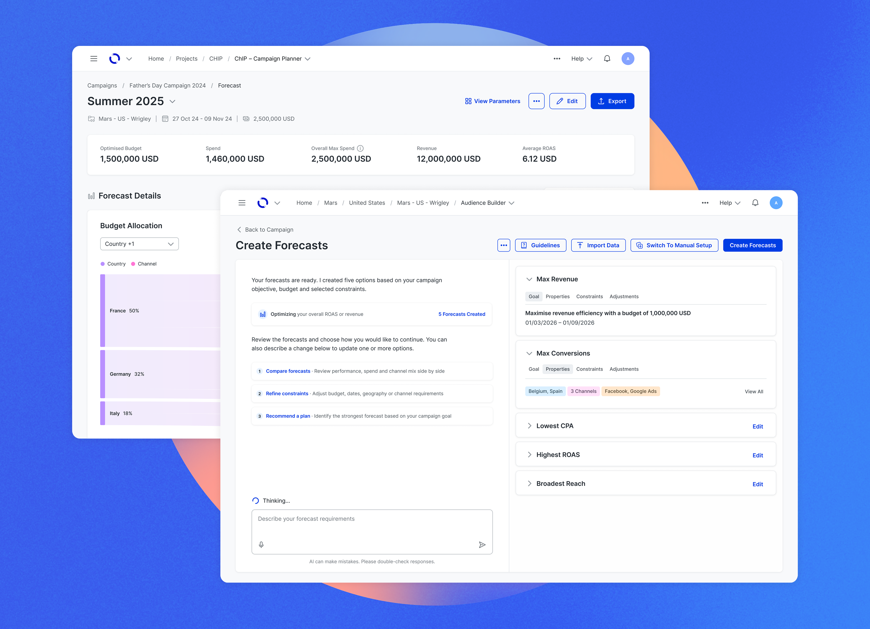
Elevating design for an enterprise media platform, using AI-coded prototypes to simplify planning and make complex data easier to understand


.jpg)


