
Product Direction
Design Leadership
Design Systems
Brand & Community
Product Launch
RAC.FM elevates the creator community around André Anjos into something fans participate in rather than consume. Exclusive content, early access to new music, production breakdowns, and a direct line between artist and audience.
The $RAC token is the mechanism: stake more, unlock more. It gives the community a real stake in the creative ecosystem, with rewards and experiences that streaming platforms structurally can't offer.

RAC once stood for "Remix Artist Collective." Today it's the solo project of André Allen Anjos, known primarily for 200+ remixes built on an unusual premise - pulling focus away from danceability and toward genuinely different arrangements.
That fanbase is now three million monthly Spotify listeners. The design problem was what to build for them.


An audience of three million monthly listeners is an asset almost no independent creator knows how to use. Streaming platforms own the relationship; the artist rents attention. The opportunity was a space André owned outright - where the community could go deeper, discover merchandise, hear new tracks first, and hold $RAC.
I led product direction across the engagement: shaping the strategy with André, translating it into a scoped product, directing a pod of junior designers, and working with the engineering team through to launch. Most of my time went to two things - deciding what the MVP was allowed to include, and making sure the design system could survive everything we deliberately left out of v1.

We launched an MVP, not a finished product, and treated the community as the research method. In-person interviews, ongoing discussion in fan channels and direct requests shaped what shipped and in what order.
The value of launching narrow was correction speed. Real usage told us where the concept held and where it didn't, and the architecture was built to absorb that - flexible enough to keep changing without a rewrite.
Beyond the community space itself, the platform carries exclusive behind-the-scenes content, interviews and deep dives into André's production process - the material that turns listeners into a community.
New music releases weekly, so the experience stays live rather than static. Fans hear unreleased tracks and engage with RAC's visual world through album artwork, interactive design elements and limited-edition NFTs, which carry their own perks: early access to events, exclusive remixes, collaborations. The design brief was to make music, art and community feel like one space rather than three features sharing a nav bar.

André's aesthetic is retro-modern - nostalgic references handled with contemporary precision, and a pink baseball cap that's become a signature. The design question was how to make a website feel like that without becoming pastiche.
We landed on a vintage operating system rendered with modern UI craft. Pixelated type, windowed layouts, playful motion - held together by fluid animation, disciplined typography and navigation that stays legible under all of it. Where most concepts like this collapse is usability; the nostalgia gets in the way of the product. Setting the constraint early - the OS metaphor never wins against clarity - is what let the pod push the aesthetic hard without breaking it.


The design principle for $RAC was transparency. Token mechanics fail on trust more than on interface, so nothing about the value exchange could be implicit.$RAC is a decentralised token owned and launched by André.
The more a user stakes, the more content unlocks - the same logic as an artist selling merchandise, art or music, in a different medium. Once a wallet connects, the interface shows exactly what's staked, exactly what that unlocks, and exactly what's still locked. No ambiguity at the moment of commitment.

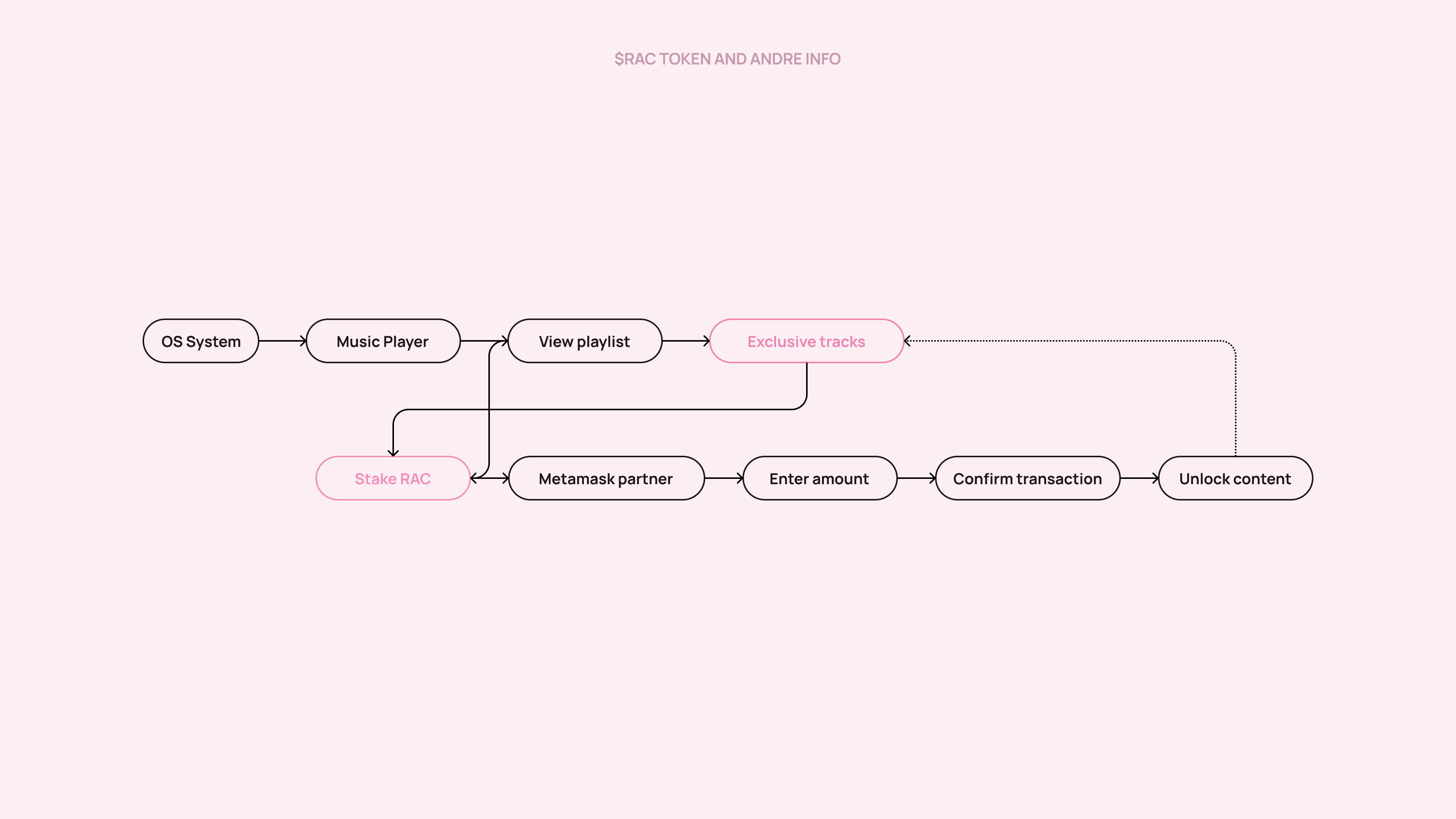
This is where the design and engineering sides of my background did the most work.
Before any visual design started, we set requirements and a sprint backlog per feature and pressure-tested each one with the development team for feasibility. Bespoke work fails on scope, so we established what was buildable before we established what it looked like.
Working with André and a pod of junior designers, we set the look - shades of pink, vintage OS detailing, bespoke iconography - and I built it as a system rather than a set of screens. The output was a library of custom dynamic components implemented in React with a Storybook integration, so the OS metaphor was reusable infrastructure instead of one-off decoration. Engineers could compose new views without redrawing the world, and junior designers had a defined surface to work within.
The result was a distinctive, detailed OS-style product that André and his fans genuinely loved - and a system that held together while several people built into it at once.


Launch pulled the full concept together: the custom OS experience, a clear statement on why $RAC exists in the crypto ecosystem, and a custom mixtape player streaming exclusive tracks. Monthly Patreon subscribers could claim $RAC by connecting a wallet and the email tied to their Patreon.
That claim flow was the trickiest thing in the build - it bridged two identity systems, and getting it to feel routine rather than technical took the most iteration of anything we shipped.


and fan website visits within the first week of launch
Active media and social coverage for the newly released platform

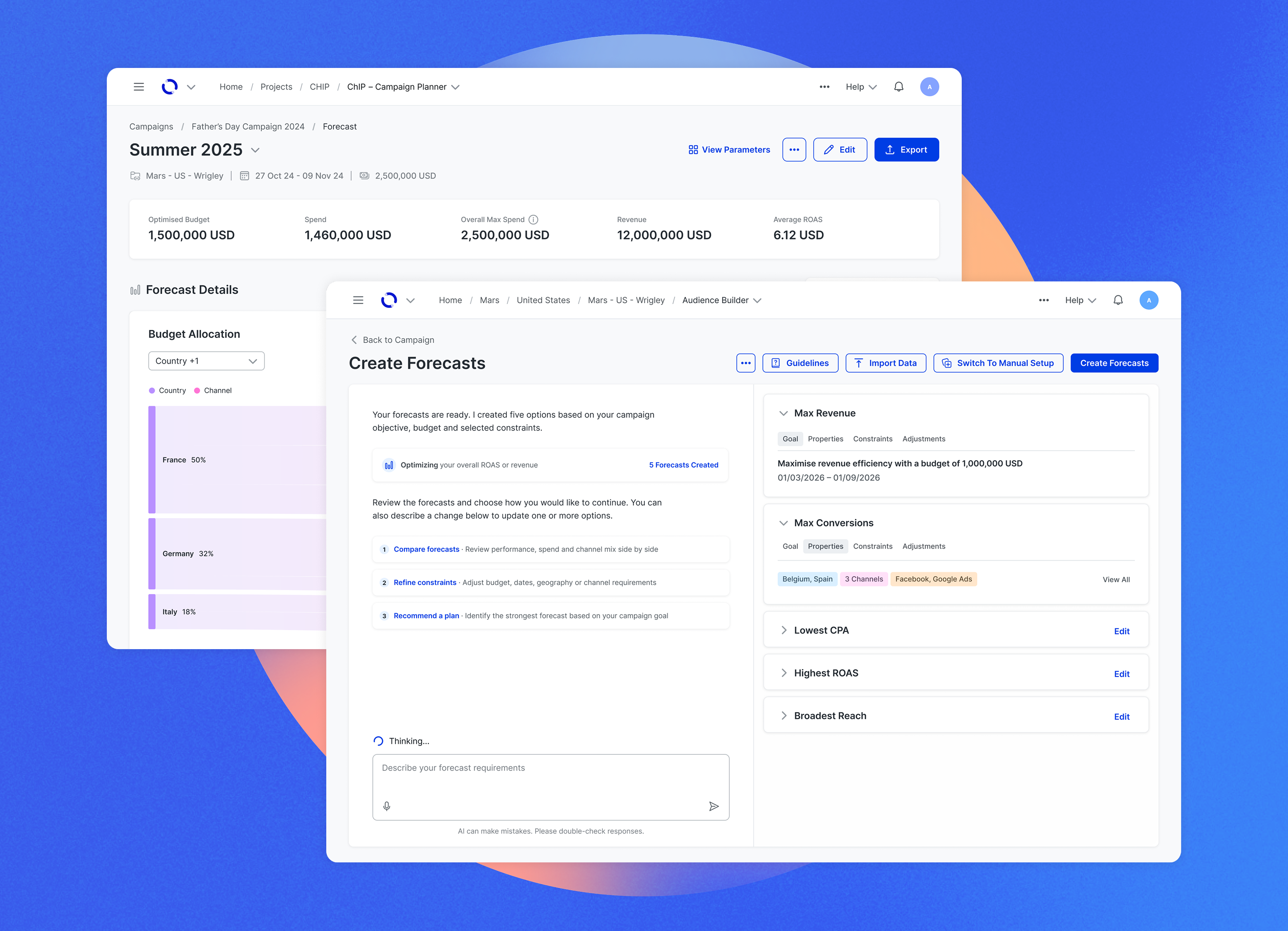
Elevating design for an enterprise media platform, using AI-coded prototypes to simplify planning and make complex data easier to understand


.jpg)


